


Ntsal built the identity for the 2025 Panorama of the European Film around the experience of sitting in a cinema. Screen light and narrative rhythm became graphic behavior: forms stretch, gather and pause across the Cairo studio's design for the festival's 18th edition.
In its designer's note for the official festival catalog, Ntsal traces the project to years spent attending Panorama. The team describes films that stayed with them after the screening. That starting point gives the identity a specific task: carrying something of the viewing experience into the material surrounding it. For an identity spanning print and motion, expansion and interruption offer rules that can survive a change of medium.
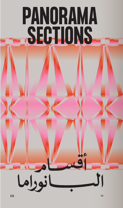
The poster makes that translation visible. Pink and orange bands widen into angular bulges, then narrow to fine connections against a pale gray ground. Their changing widths suggest intervals with different durations. Small boxed numbers punctuate the composition. Even in print, there's a sense of time being stretched across the page.
Ntsal Cairo: Panorama of the European Film
Typography supplies a second kind of memory. Ntsal's custom Arabic headline face, NT Panorama Naskh, draws on lettering in old Arabic newspapers and vintage film posters, as the team explains in It's Nice That. On the poster, long black horizontal strokes hold the Arabic title beneath the patterned field, above a condensed uppercase English title.
For a festival presenting European cinema in Cairo, those references give the identity a local point of connection. The graphic treatment interprets how films unfold; the type recalls how Egyptian audiences encountered them on posters. Both belong to the cinema experience, but they address different parts of it.
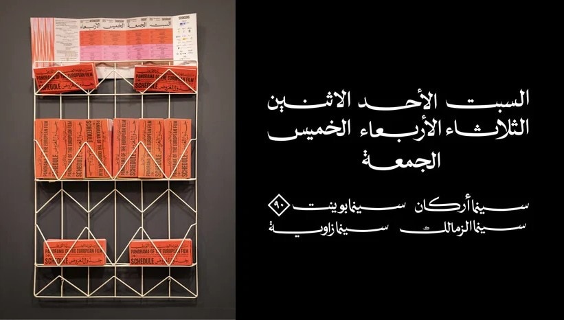
The schedule brings that thinking into the audience's day. According to the same interview, Ntsal designed it as a printed checklist so visitors could map their own sequence of screenings and venues. A festival has an official program; each viewer makes a selection within it. Here, the idea of a timeline becomes something a person can mark on paper.
For designers building an event identity, that's the useful move to study: follow a concept into an ordinary task. Choosing a screening gives the visual idea a job to do.
 itsnicethat.com


Discussion