


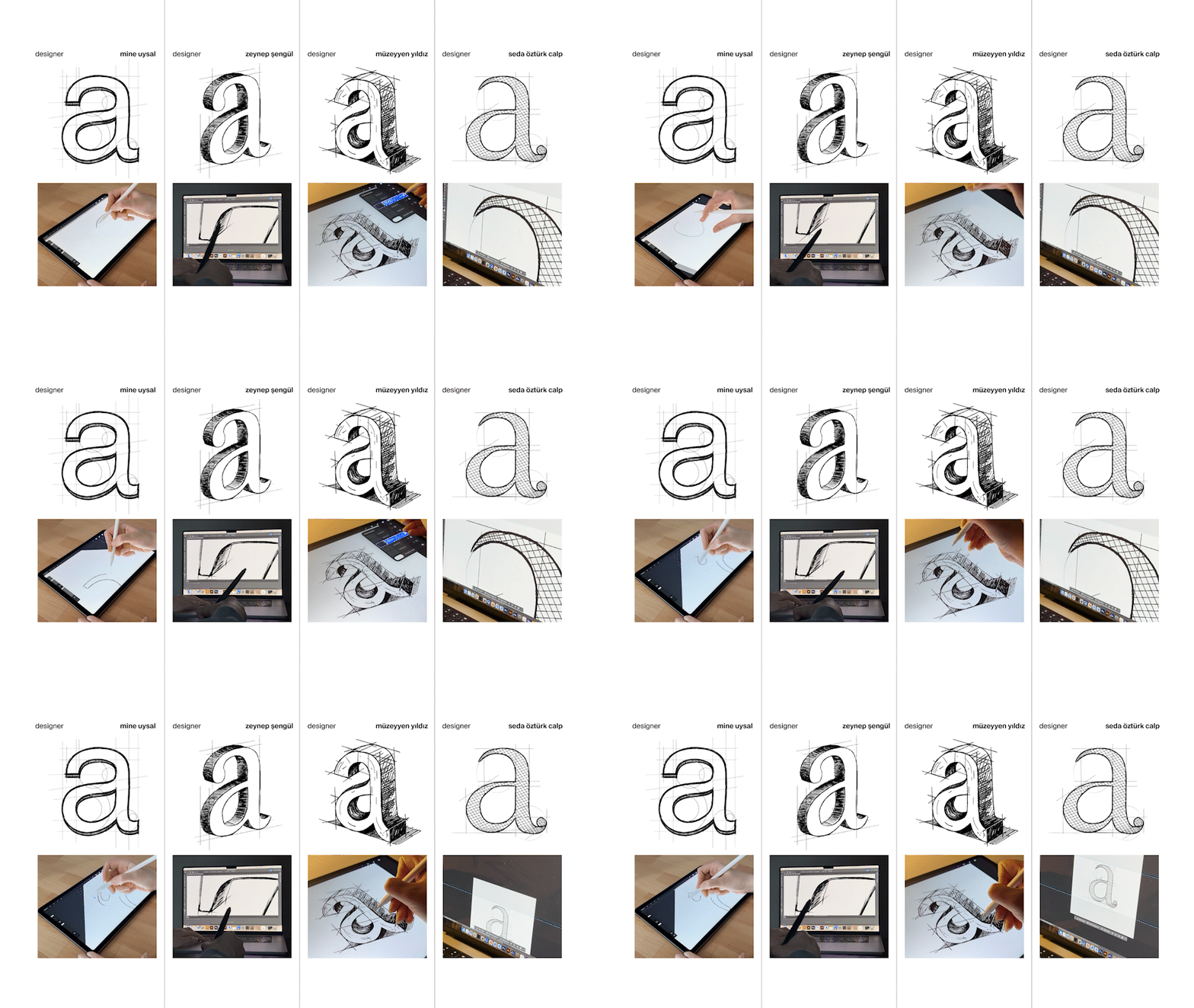
Concept Typography begins where familiar rules end: an alphabet does not have to look as if it was drawn by a single hand. The project grew out of the name Concept itself. The team connected the word with an idea in its earliest form, which led them toward a visual language designed to remain open, unfinished, and evolving. Built collectively inside Concept Istanbul, the system uses a shared skeleton for letters and numerals that different designers can reinterpret through line, texture, construction, and mood. So far, 13 designers have contributed to the project. With 106 letters and numerals already in the library, and applications extending into signage and other identity materials, the project has moved well beyond a type specimen.
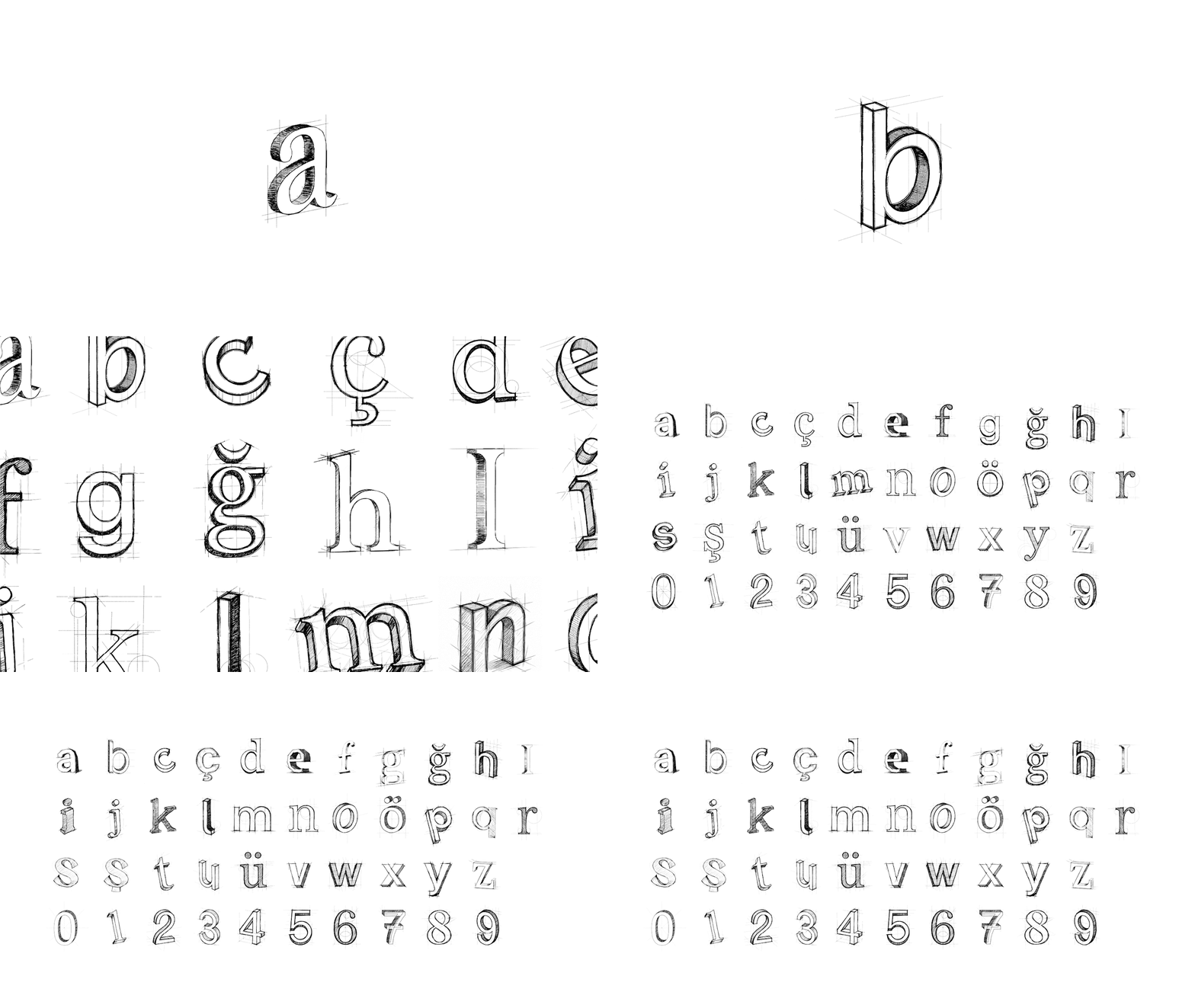
The most interesting part is the rule underneath all that variation. Many brand systems pursue coherence by reducing difference: one typeface, one rhythm, one approved visual surface. Concept Typography keeps that rhythm deeper in the system. Basic proportions and character skeletons keep the letters recognizable, while their visible treatment remains individual. The constraint is simple, but it gives all that variation a common foundation. The project line, "one letter, many minds," lands because it describes exactly what the alphabet makes visible: different hands working within the same structure.
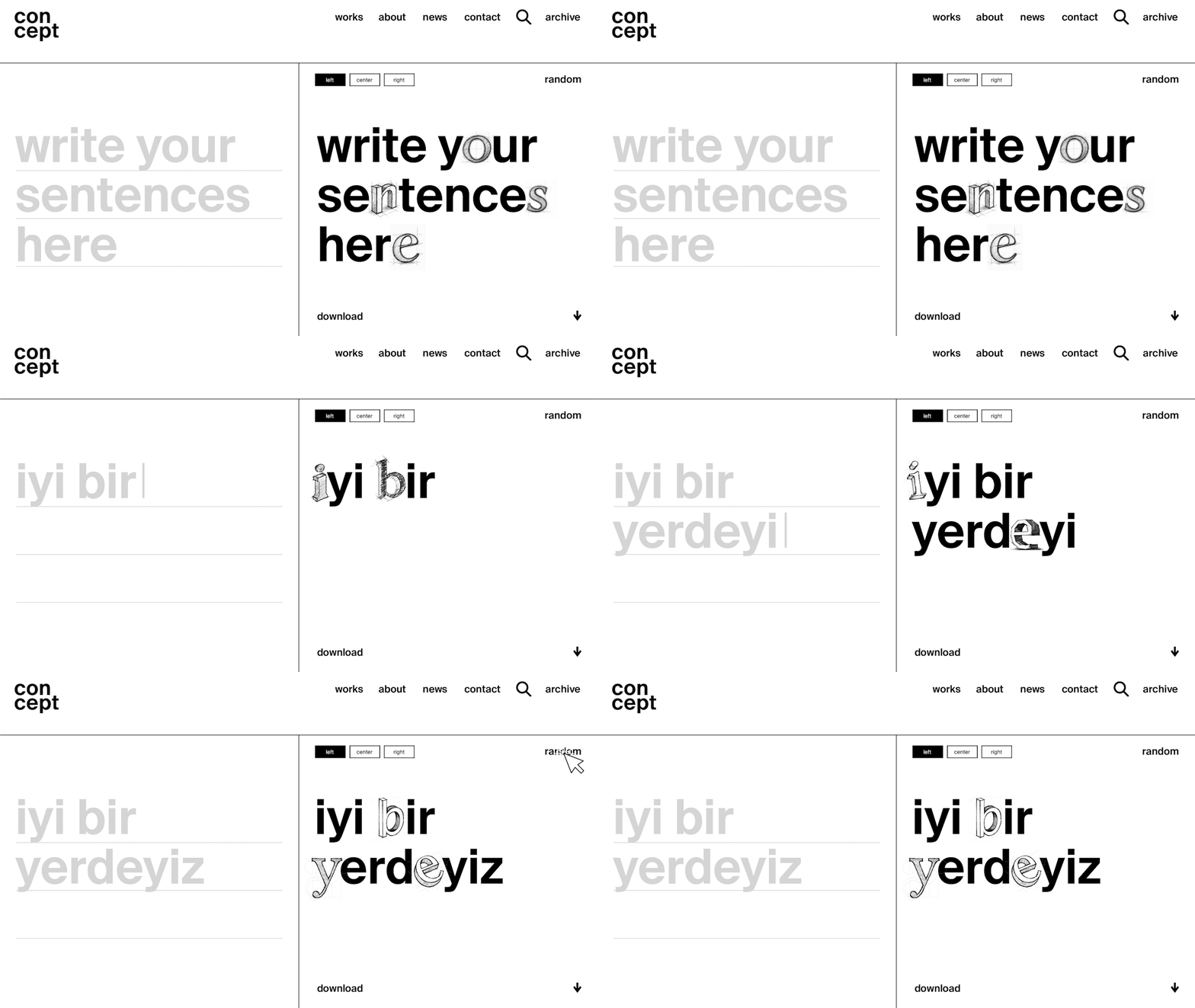
The online generator lets users apply the alphabet to their own compositions. Here, it is important to distinguish the roles: designers expand the alphabet; users recombine it. They simply enter text and choose an alignment, after which the site randomly pulls letter variants from the existing library. The same phrase can look different on the next run, while the underlying character system keeps each version recognizably part of the same alphabet. The interaction stays playful without blurring where the authorship of the alphabet actually sits.
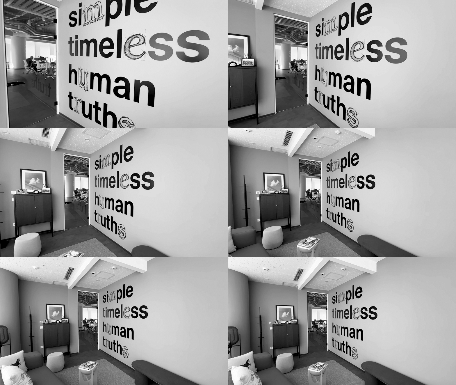
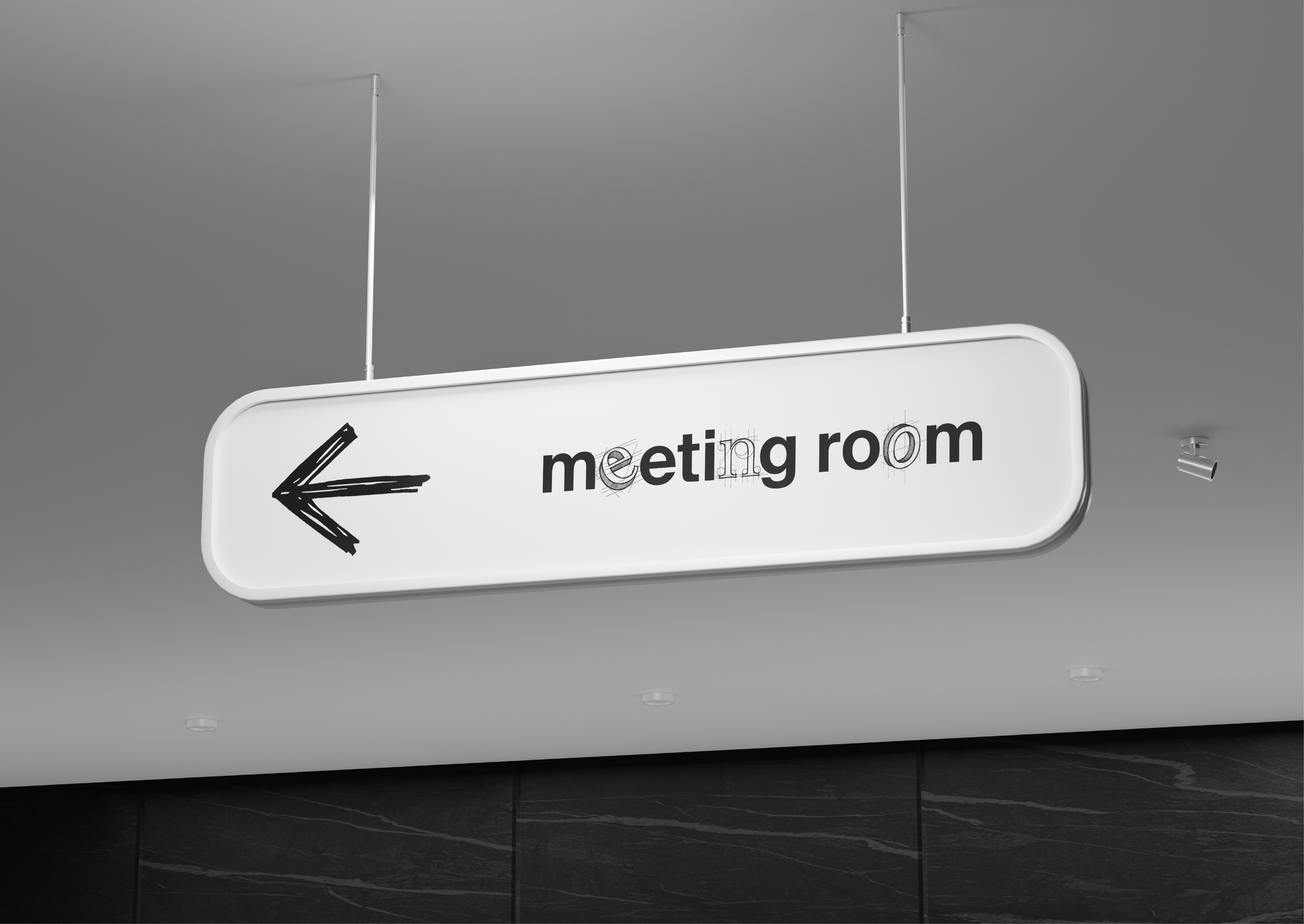
The system extends beyond the browser into signage, walls, notebooks and wayfinding. Across those applications, the alphabet can change dramatically without losing its identity. Concept Typography shows how a shared structure can hold very different visual voices together, not by making them look alike, but by giving them something consistent underneath.


Discussion