Your logo lives a double life.
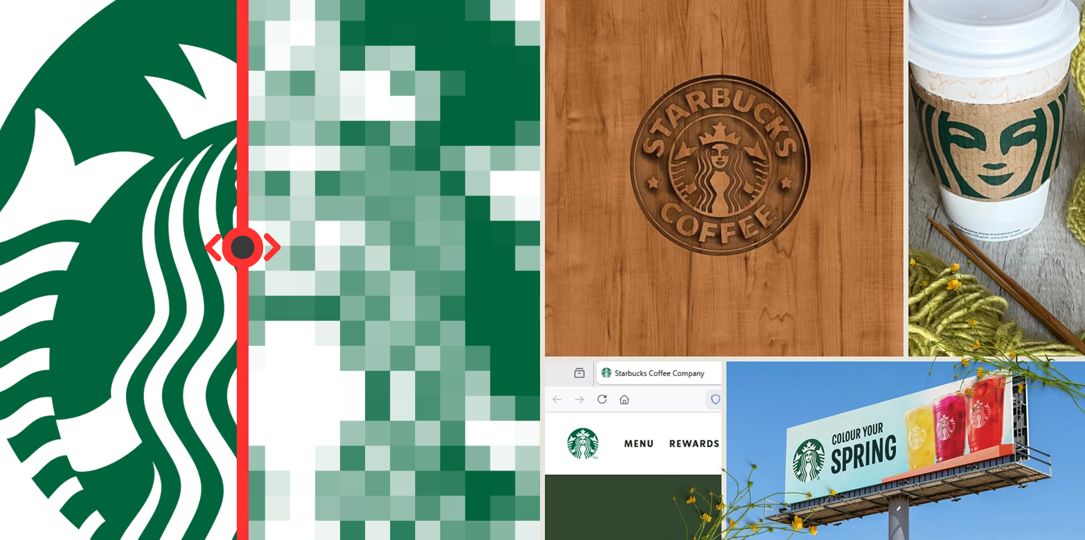
One day it's 16×16 pixels on a browser tab. The next it's on a billboard someone's driving past without really looking. That's a pretty wild range when you think about it.
And here's the thing that trips up most logos: too much detail.
You spend weeks on this intricate icon, fall in love with it, and then at favicon size it's just... a blob. Or someone's 50 meters away from your outdoor sign and all those clever little touches you were so proud of? Gone. The further away the viewer, the fewer details they can actually see.
But can we get more precise about this? Can we actually measure how "detailed" a logo is?
Turns out, yes.
What Even Is a "Detail"?
Let's get a bit nerdy here.
A detail is basically a boundary where one shape ends and another begins. It's a moment of change in the visual. Every time there's an edge or a transition between two spaces, that's a detail.
So if you want to count the details in a logo, you're essentially counting the edges. A simple square has 4 edges. A star has more. A complicated illustration might have dozens or even hundreds.
Let's say you have a logo with a figure that has 7 distinct boundaries. Simplify it and you might get down to 4. Simplify further and maybe you end up with just 1 bold shape.
That's not laziness. That's intentional reduction.
Why Does This Matter?
Two reasons.
First: small formats.
App icons can be as small as 16×16 pixels. Social media avatars aren't much bigger. When you have limited pixel real estate, complex shapes just turn into mush. There simply aren't enough pixels to render all those carefully crafted details.
This is why logos tend to work better when they're roughly square or circular. They fit naturally into these tiny formats without needing a completely separate version. And every time you create an alternate version, you're splitting brand recognition.
Second: textured materials.
This one catches people off guard. When you put a detailed logo on fabric, brushed metal, concrete, or any textured surface, something weird happens. The small parts of your logo start "merging" with the texture of the material itself. The logo kind of melts away.
The fewer details in your logo, the larger each shape becomes. Larger shapes are less likely to get lost in whatever surface they're printed on.
The Squint Test
Here's a quick way to check if your logo has this problem.
Squint at it.
When you squint, fine details blur and you only see the major shapes. If your logo still reads clearly, you're probably fine. If it turns into an unrecognizable mess, you might have too much going on.
You can also shrink it to favicon size on screen. Or print it really small. Or just step back from your monitor until it gets fuzzy. Same idea.
How to Reduce Detail Without Losing the Idea
The goal isn't to make everything a boring circle. The goal is to communicate the same idea with fewer visual "moves."
Think of it like this: every edge in your logo is asking the viewer's eye to do work. The more edges, the more work. Simplifying means finding ways to combine multiple details into one, or removing elements that aren't doing enough to justify their existence.
Sometimes this means taking a detailed illustration and finding its essential silhouette. Sometimes it means removing interior details and keeping only the outline. Sometimes it means realizing that two shapes can become one.
The interesting part is that constraints often lead to more creative solutions. When you can't rely on lots of little details to make something interesting, you have to find ways to make bold, simple shapes carry the weight.
The Catch
Not every logo needs to be ultra-minimal. Sometimes a detailed illustration mark is exactly right for a brand. But if you go that route, you need to be aware of the tradeoffs and plan for them.
That might mean creating a simplified version specifically for small applications. Or accepting that some use cases just won't work as well. Or being very intentional about which materials and sizes you'll actually use the logo on.
The point isn't that simple is always better. The point is that detail has a cost, and it's worth understanding what that cost is before you fall in love with something too complicated for its own good.














Discussion