

Here's the thing about operating system updates: everyone loses their minds over the flashy stuff. New apps, new features, new ways to send money to friends or whatever. But the changes that actually affect your daily experience? Those slip by unnoticed.
I've been staring at iOS 26 for months now, and only recently did something click. Apple killed all caps throughout the entire system. And honestly? It's kind of a big deal.
Wait, What Changed Exactly?
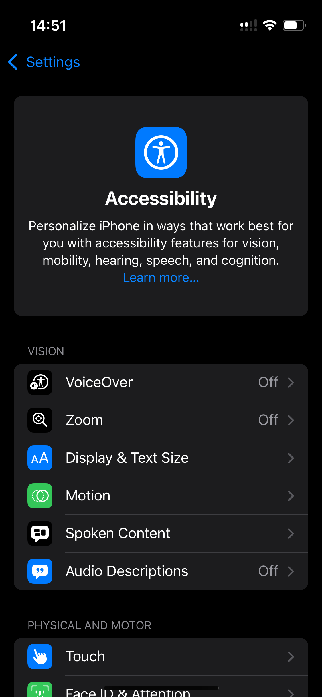
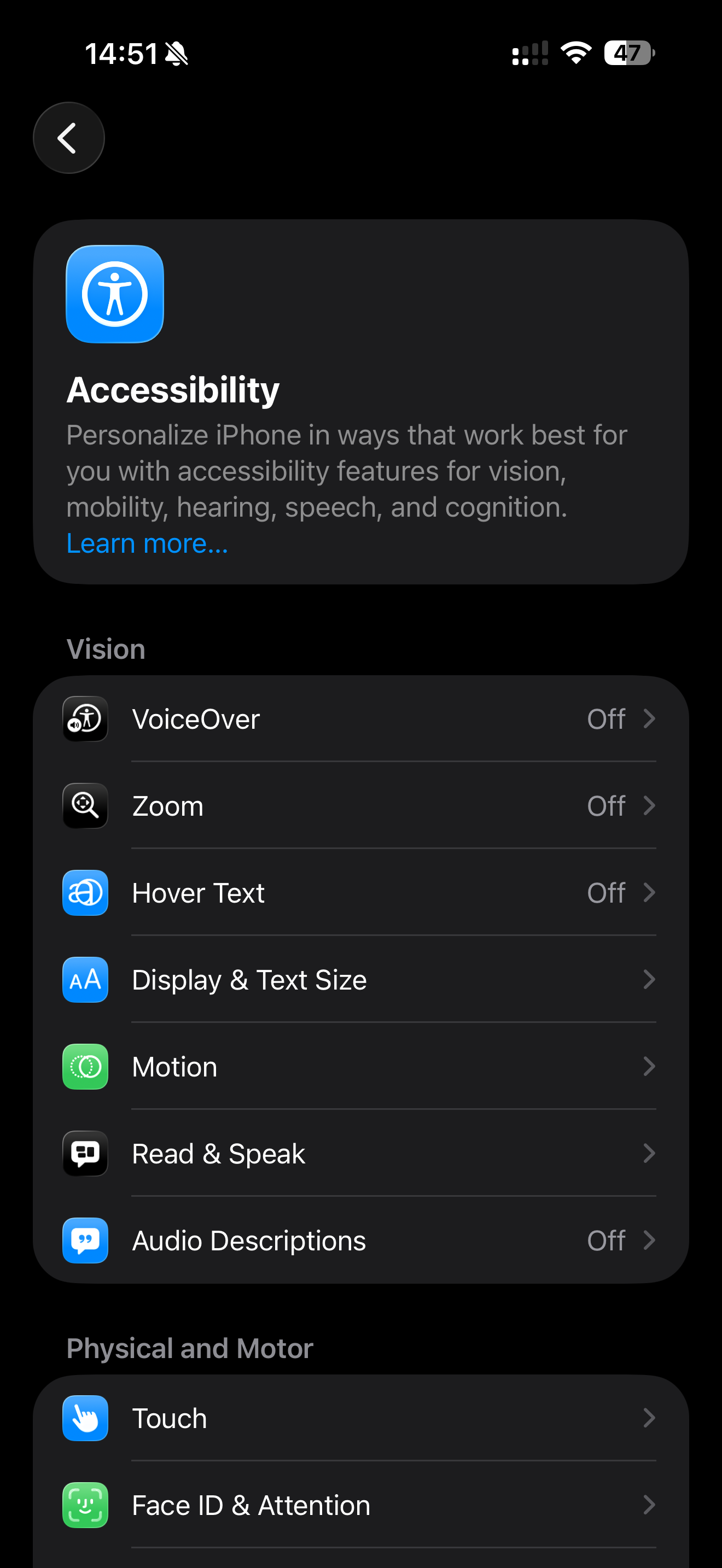
Pull up your Accessibility settings and compare them to iOS 18. See those section headers? They used to scream "VISION" and "PHYSICAL AND MOTOR" in aggressive uppercase. Now they just say "Vision" and "Physical and Motor" — sentence case with a slightly bolder weight.
Seems tiny, right? But this typography change ripples through every single settings screen, every list, every menu. Billions of devices, countless screens, all suddenly... quieter.
Why Uppercase Typography Was Always Kind of Annoying
Here's a quick typography lesson that changed how I think about design.
All caps text is harder to read. Not dramatically harder — you're not going to struggle through a three-word header. But your brain has to work slightly more. See, when we read lowercase text, we're not actually reading individual letters. We're recognizing word shapes. The ascenders on letters like "h" and "d," the descenders on "g" and "y" — they create distinctive silhouettes our brains process almost instantly.
Uppercase typography flattens everything into uniform rectangles. Every word becomes a block. Your brain has to slow down, parse each letter, reconstruct the word. It takes milliseconds longer, but those milliseconds add up across hundreds of daily interactions.
Typography nerds have known this forever. Apple finally listened.
The Other UI Changes You Probably Scrolled Past
While we're noticing things, the screenshots reveal more subtle refinements:
That back button got a glow-up. Instead of a floating blue chevron next to "Settings" text, there's now a circular dark container holding the arrow. Cleaner. More intentional. The navigation feels like its own element now rather than a text link pretending to be a button.
The header card layout shifted. The Accessibility icon moved from dead center to the top-left corner. Text went from centered to left-aligned. Why does this matter? Because that's how you actually read — top-left first, then across and down. The old centered layout looked nice but fought against natural eye movement.
Typography weight compensates for lost emphasis. Without the uppercase screaming for attention, the headers needed something else. Apple bumped up the font weight slightly. Same hierarchy, better readability. Smart trade-off.
Apple Has a History of Sneaky Typography Updates
This isn't their first rodeo. Apple has been quietly tweaking system typography for over a decade, and most people never notice until someone points it out.
Remember iOS 7? Jony Ive's team went ultra-thin with Helvetica Neue, and people complained about legibility. iOS 7.1 shipped with adjusted font weights across the board. Nobody announced it. It just got easier to read.
Then iOS 9 introduced San Francisco — Apple's first custom typeface built specifically for screens. The letterforms were optimized for pixel grids with optical size adjustments depending on context. Your phone got more readable overnight and you probably thought your eyes were just having a good day.
iOS 13 brought SF Symbols, replacing static icons with vector glyphs that automatically match surrounding typography weight. Again, not a keynote moment. Just everything looking slightly more polished without explanation.
Apple understands something important: typography improvements don't make good marketing. You can't put "we made text 3% easier to read" on a billboard. But these changes affect every interaction, every day, for years.
The Death of Uppercase UI Typography?
Here's what I find interesting about this particular change. All caps in interface design was borrowed from a different era — printed forms, signage, environments where you needed to grab attention fast. Makes sense on a highway sign. Makes sense on a warning label.
But phone interfaces aren't highway signs. You're not glancing at your settings menu while driving past at 70 miles per hour. You're focused, trying to accomplish something specific. The typography should support that focus, not compete with itself for attention.
Uppercase headers always carried this vaguely aggressive energy. Like the interface was mildly shouting at you all the time. "VISION." "PHYSICAL AND MOTOR." "PRIVACY." Calm down, Settings app. I'm just trying to change my wallpaper.
Sentence case feels more conversational. More like a helpful guide, less like a bureaucratic form. It's the typographic equivalent of someone lowering their voice.
What This Means If You Design Things
When Apple makes a typography decision affecting two billion devices, it's worth paying attention. They have more user research data than basically anyone. They tested this extensively before rolling it out.
The message seems clear: all caps is falling out of favor for organizational UI elements. The visual hierarchy benefits don't outweigh the readability costs.
If you're still using uppercase section headers in your apps or websites, maybe take another look. Not because Apple said so — but because they just validated what typography experts have argued for years. Sentence case reads better. Your users' brains will thank you, even if they never consciously notice why.
The Best Design Changes Are Invisible
That's the paradox of good typography work. When it's done right, nobody notices. The text just... works. Information flows smoothly. Decisions feel easier. Screens feel calmer.
It's only when typography is bad that people pay attention. Tiny fonts, weird spacing, aggressive caps everywhere — these create friction you feel but can't always name.
Apple removed some friction. Most people won't notice. The experience just got slightly better for everyone, and the world moved on.
That's how good typography changes work. Invisible improvements that compound silently over time. Kind of beautiful when you think about it.


Discussion